FoodUp Mobile App
Team
Lead Product Designer (Yeoj Kwon)
1 iOS Engineer
1 Android Engineer
1 Junior UX Designer
1 Brand Designer
1 iOS Engineer
1 Android Engineer
1 Junior UX Designer
1 Brand Designer
.
Role
Shipped the mobile app (both iOS and Android)
UX strategy, User research, Prototyping, Design systems
UX strategy, User research, Prototyping, Design systems
.
Timeline
10 weeks
Context
What is FoodUp?
FoodUp is a social platform that connects people to great restaurants and food, as voted for by locals. As a Product Designer, I was responsible for their app redesign for both iOS and Android.
Why Redesign?
FoodUp launched its app a few years ago but hasn't had any updates since. One of the main business problems was that the app had a lot of data in the back-end, but the team did not know what or how to surface them upfront. Plus, the visual design was outdated. In order to increase user engagement and returning rate, the app needed an overhaul.
FoodUp App (Previous)
Business Goal
Success Metrics
The FoodUp app has a good amount of active users, although it hasn’t updated much in a while. The goal is to further increase even more user engagement and track weekly/monthly active users who are already interested in using the product more often.
Product Problem
Information Architecture
First, the app had complex navigation that makes users find their way around instead of allowing the app to discover content easily for them. Another problem was that there were a lot of dead ends (like Search, Favorites, and Activity tabs) that didn't have any action items for users.
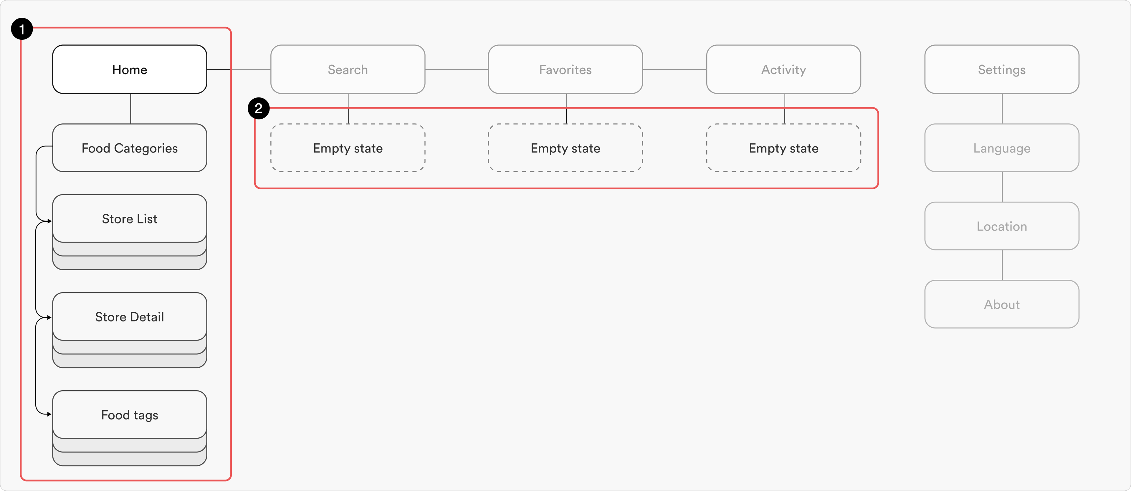
Current IA
How Might We Statement
How might we create a seamless and user-friendly experience that new users engage early and often, driving an increase in engagement and retention?
User Research
User Interview
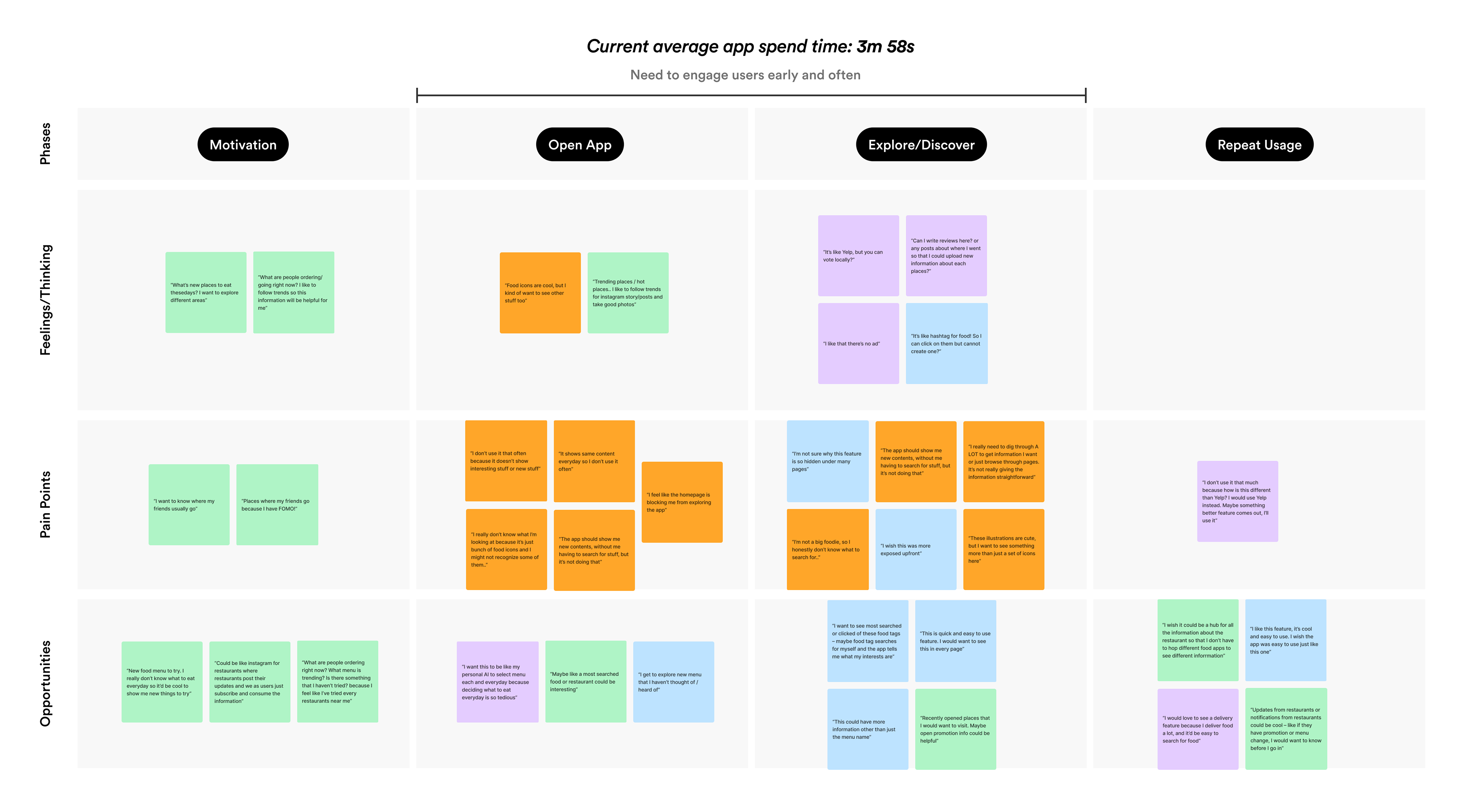
I conducted user interviews with 12 users, from daily to infrequent users of the app. Interviewees’ age ranged from 17 to 34 years old. I led the interviews to learn more about their behaviors when using the app, and based on their responses, I mapped out their quotes/comments in a user journey, from being motivated to use the app, opening and using the app, to repeating the usage.
User Research
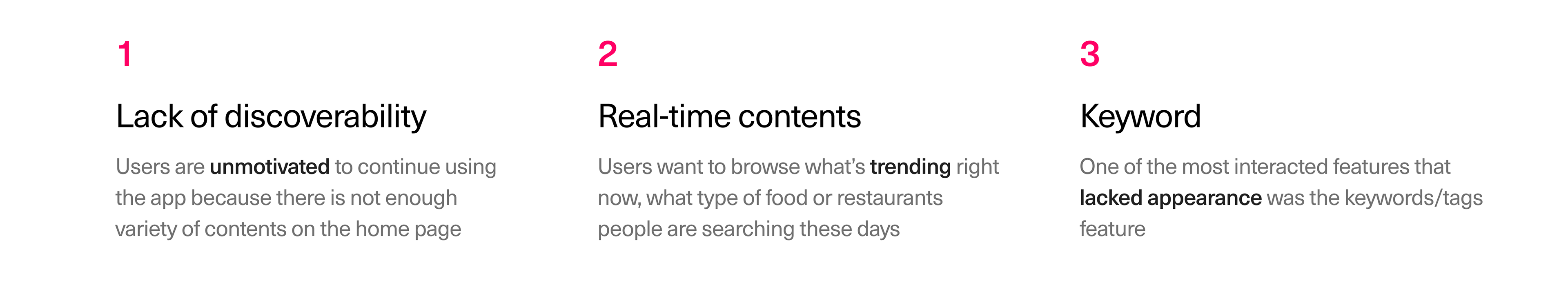
Key Takeaways
Hypothesis
If users can discover trending and real-time content easily and quickly, then they will stick to the app longer and more often
Solutions
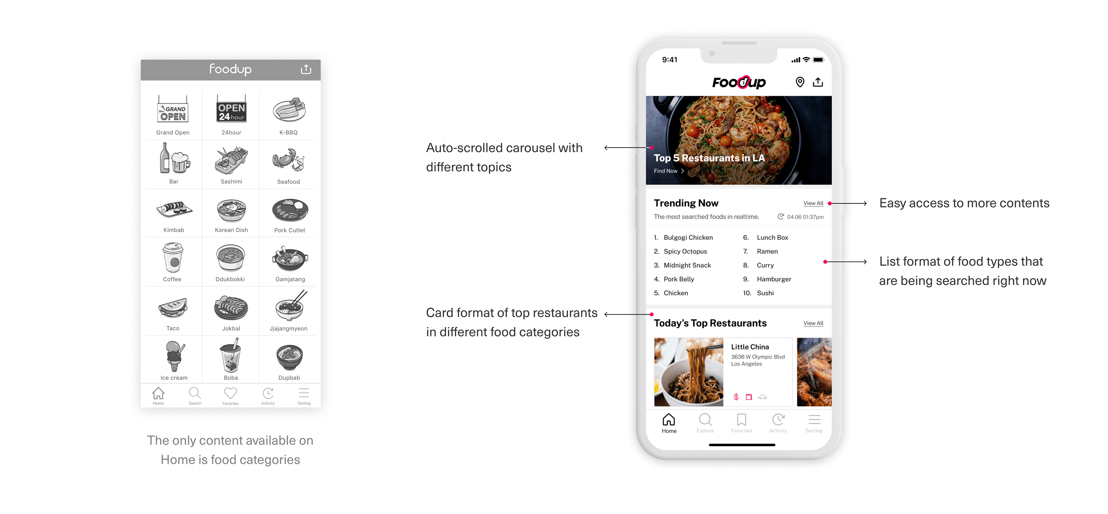
1. Surface diverse contents in different formats
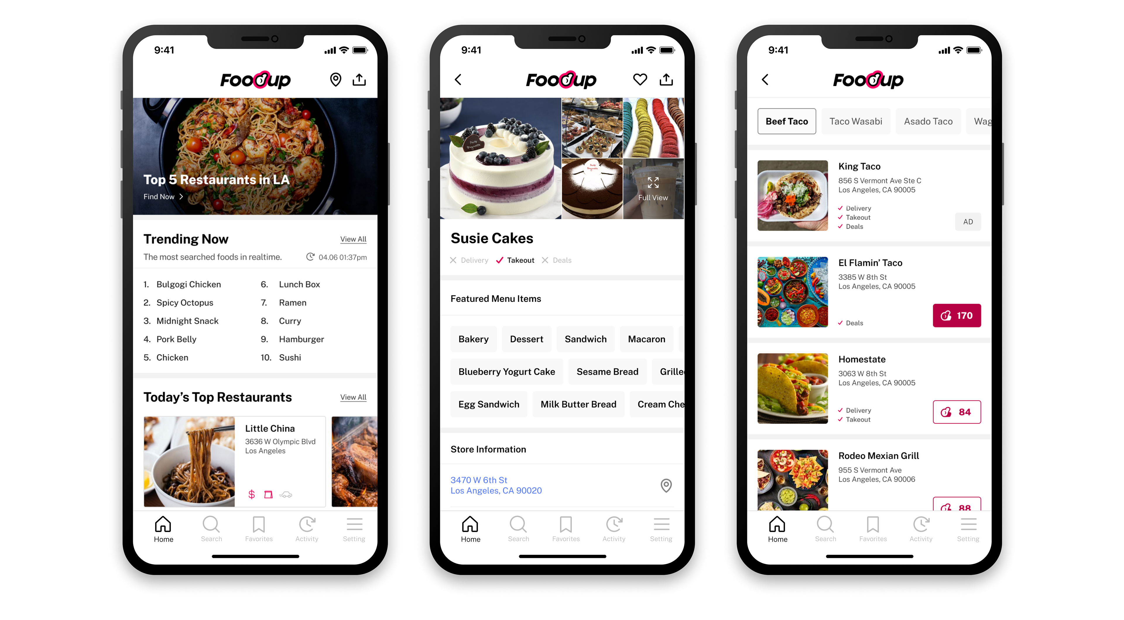
When users open the app, a list of food categories was the only thing available on Home. In order to solve this pain point, the solution was to display diverse contents that were already available in the back-end. The page is divided up into sections with visual treatments like banners, lists, and cards, to show various themes like popular searches, or trending restaurants.
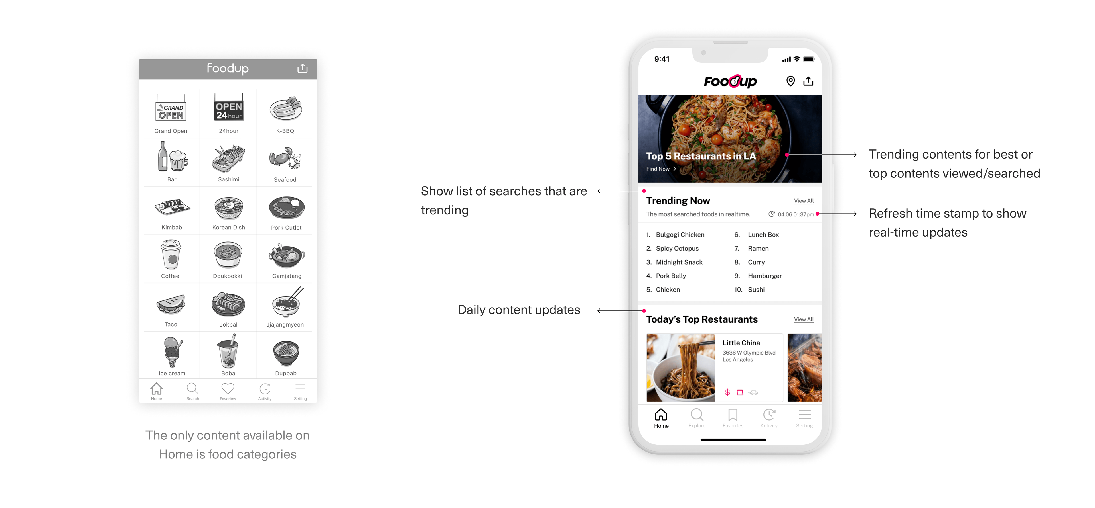
2. Fulfilling users’ needs for real-time content
One of the user pain points was that they wanted to see real-time content. By surfacing information that is time-sensitive (like 'Today's Best Restaurants'), users will discover new content every day as soon as they open the app. This will motivate users to check back on the app, eventually increasing users' returning rate.
3. Engaging users with most interacted and wanted features
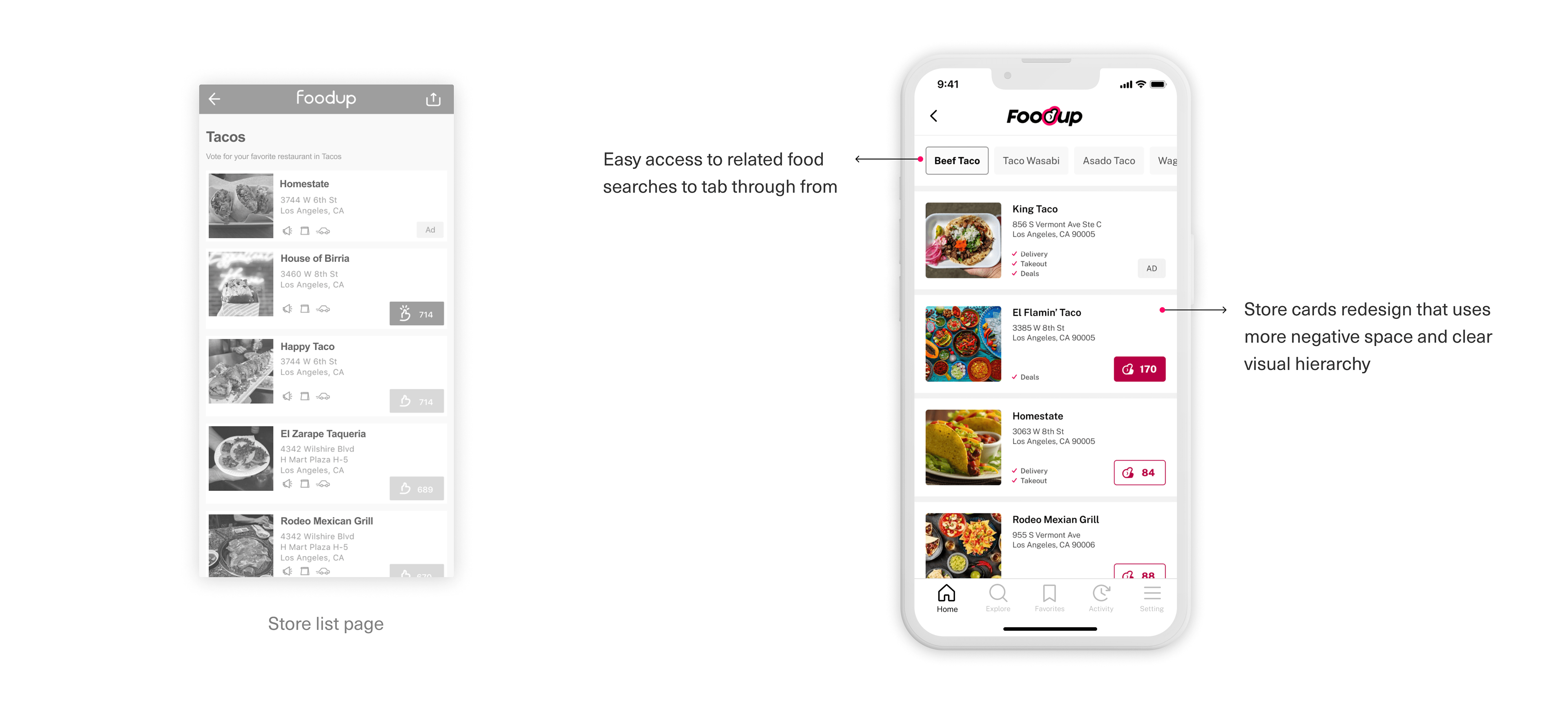
Food or menu keywords/tags are what is unique about FoodUp and differentiate from similar apps. They are also one of the most used/wanted features on the app. The old design did not have the best experience for users to fully take advantage of this feature. As a solution, I've prioritized this feature as one of the core experiences throughout the app and also de-prioritized other features that weren't as useful so that the main feature could engage more users.
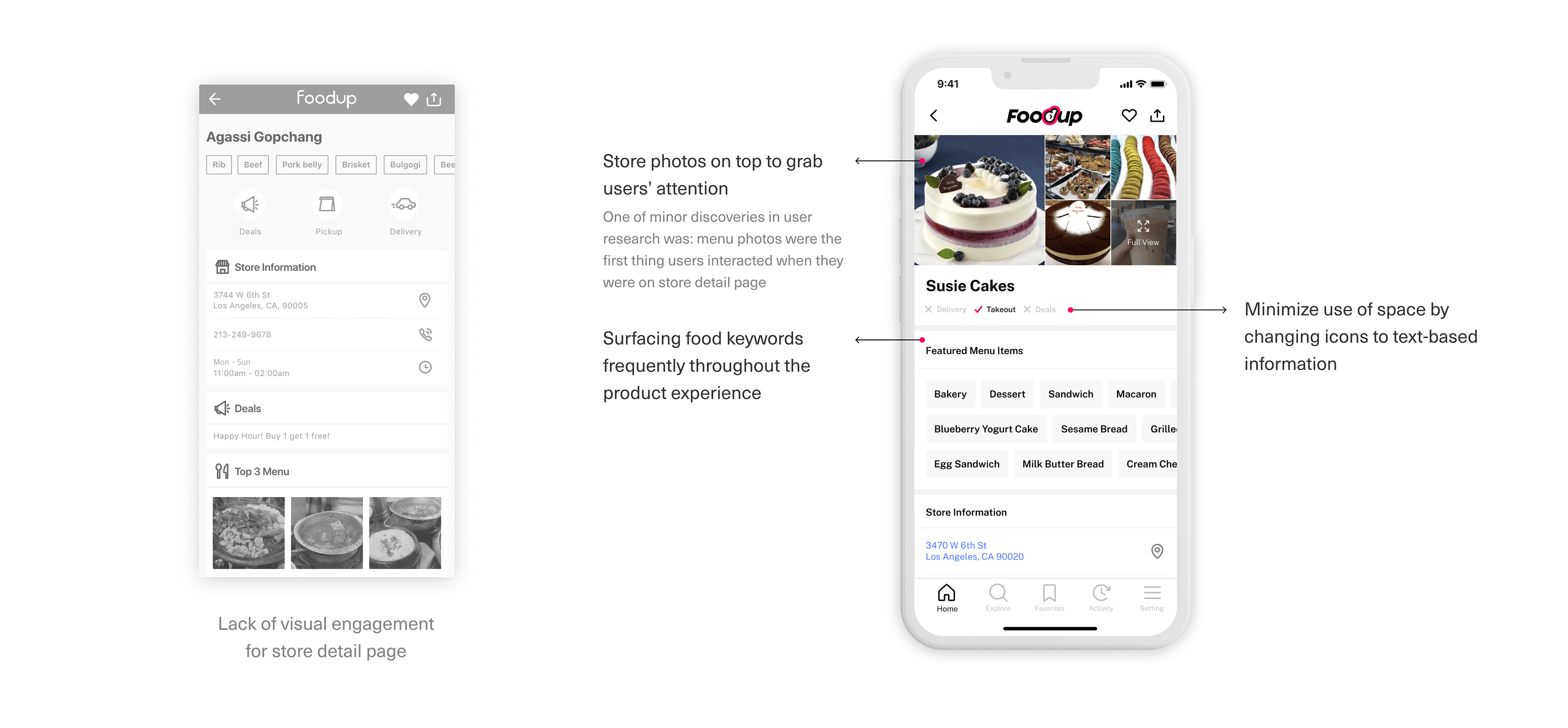
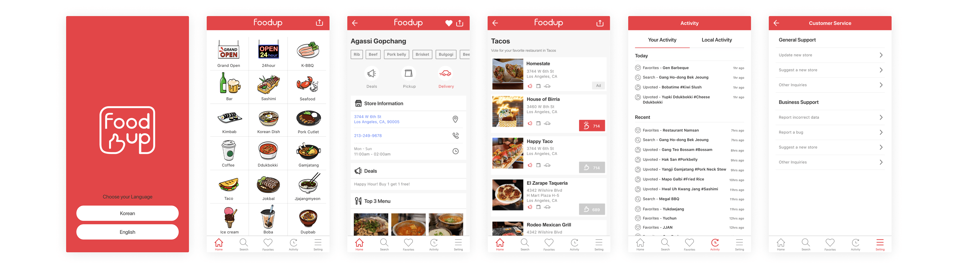
4. Upleveling overall visual hierarchy and engagement
On top of UX problems, there was lack of visual engagement throughout the app. The redesign up-leveled the visual hierarchy by making elements use more neg space and providing accessible design by increasing the contrast.
5. Taking a dead end as an opportunity to engage more users
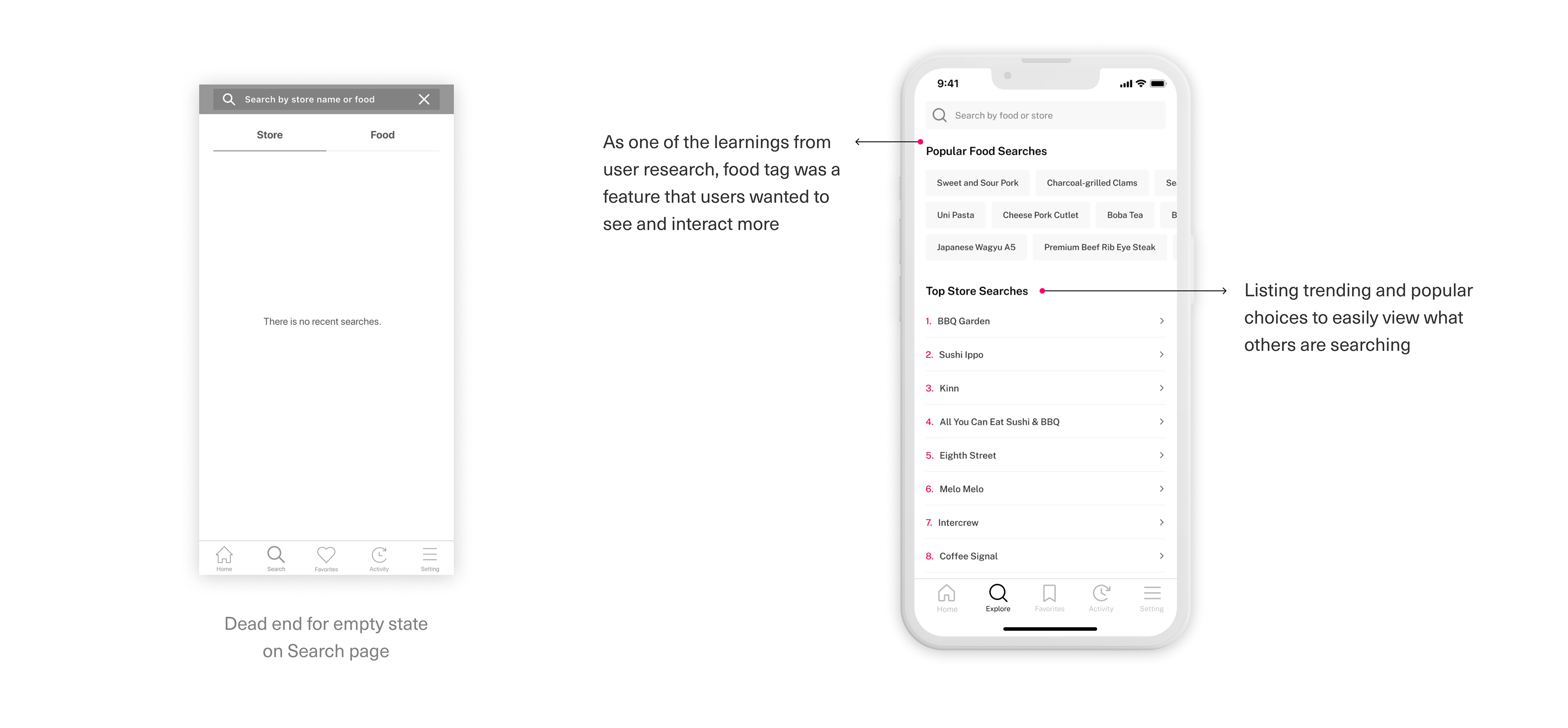
The user flow, where users first interact with the 'Search' page, takes them to a dead end – it just shows that they don't have any recent searches. I took this as an opportunity to engage more users by providing popular food searches or top store searches. The pre-populated searches will encourage users to explore more in case users don't know what to search for.
Result
Impact
• Increased average engagement time +396%
• Increased DAU/MAU from 4.2% to 7.9%
• Increased x2 engaged sessions per user
• Increased DAU/MAU from 4.2% to 7.9%
• Increased x2 engaged sessions per user
Potential Improvements
If the team had more resources, I would conduct A/B tests with different design options to determine what in particular works well and what doesn’t by testing the overall user experience and visual design.